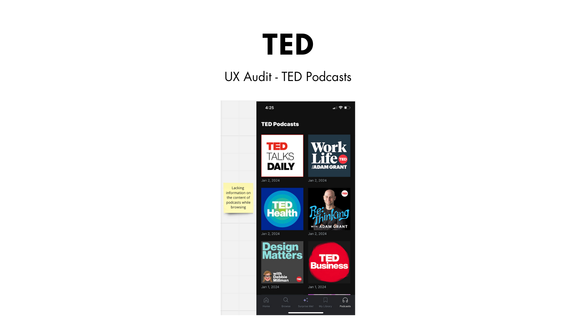
TED is an online platform of over thousands of talks geared to stir your curiosity, foster community, and create impact
With a platform filled with “ideas worth spreading,” the ability to search, save, and share thought-provoking TED talks with ease and adventure is optimal for users. The UX copy of the TED app needs to be clear, accessible, and full of easy to navigate discovery.
Therefore, through this spec project I audited and re-wrote the UX copy for the TED iOS app to address pain points within the user journey so users can best progress through the flow.
First, I did desk research to understand TED’s mission, brand voice and audience, then I ran a first click test to examine the effectiveness of the user flow and ux writing of the app and how well it takes into account user’s tasks upfront, and then I conducted conversation mining to better understand users’ pain points.
Next, I completed a UX copy audit of the TED app
Below is the re-write of the TED UX copy and rationale


